Web designing and development has a great future ahead since everyone wants to have their own website for reaching more audience and grow their business. It can simply be a blog or an e-commerce website. But for making it user-friendly, developers need to make it work responsively on every device as everyone will not access the website on a computer every time. People often use their mobile phones and tablets since they are the most easily accessible devices and are easier to handle. Hence, if you are building a new website for yourself, there is a simple way by which you can view the mobile site on the desktop.
Yes, it can be useful for many users in various ways. Let’s suppose, in case you are using a metered connection, and the website is taking too long to load because of slow internet speed. You can simply switch to the mobile version and save some data as well as time. Hence, you might be wondering “how to access the mobile version of the site on pc?”.
How to View Mobile Version of Website on PC
Either you are a developer who is learning the basics or you just want to know “how to view the mobile version of a website” out of curiosity. There are various ways by which viewing the mobile site on a desktop is possible. But, we will be discussing the easiest and simplest ways so that nobody’s time gets wasted on that.
1. Using Developer tools
In case you are curious to see the mobile view on desktop, you should be aware of the developer tools that most popular browsers usually have. These developer tools can help you to access some information on what’s happening behind the scenes. We will be getting into the details some other day. So, let’s only focus on viewing mobile sites on desktop at the moment. Generally, we use Google Chrome browser as our default one. But, in case you are a Firefox user or want to view the mobile version of a website even on Microsoft Edge. We will show you exactly that.
A. In Chrome
For the Chrome users, accessing the mobile view on a desktop is pretty simple and straightforward. All we need to do is access the Developer tools and make some clicks here and there, that’s it. So, follow these steps for viewing mobile sites on desktop using the Chrome browser.
Step 1: Launch Chrome browser on your PC.
Step 2: Now, if you wish to view a particular website, visit the website address. Otherwise, you can proceed with the steps by staying on the homepage as well.
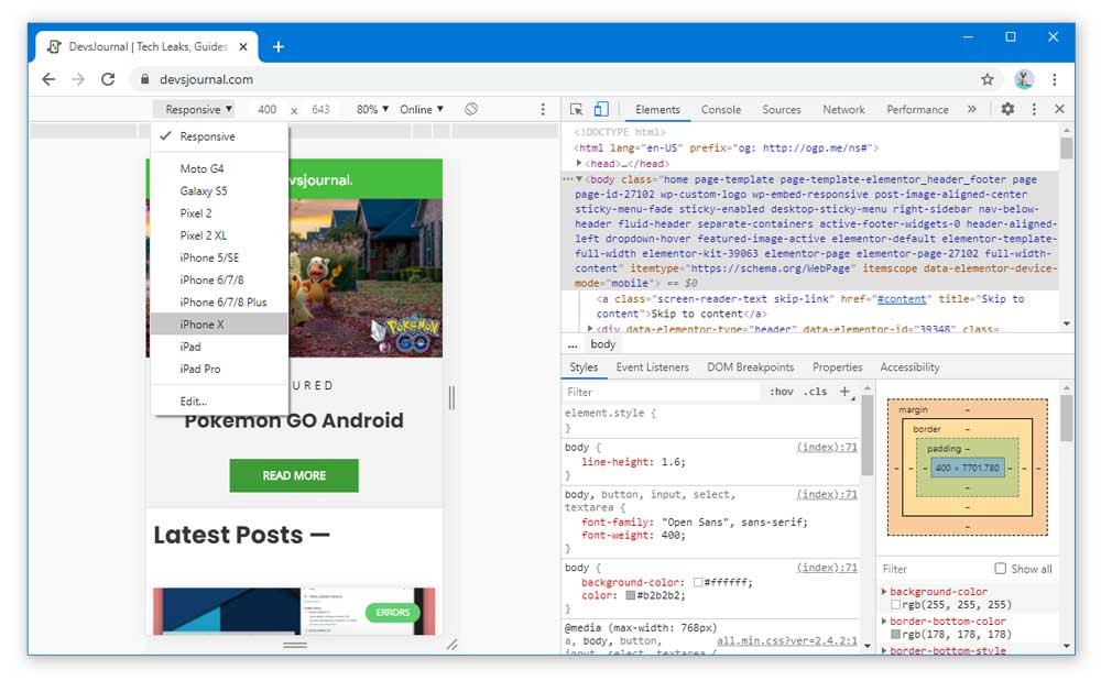
Step 3: We will need to access the Developer tools, so click on the Three-dots icon present on the top-right corner of the browser.
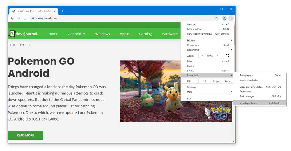
Step 4: Expand the More Tools option, and click on Developer Tools. The simple shortcut to access the Developer tools is by pressing Ctrl + Shift + I or F12.
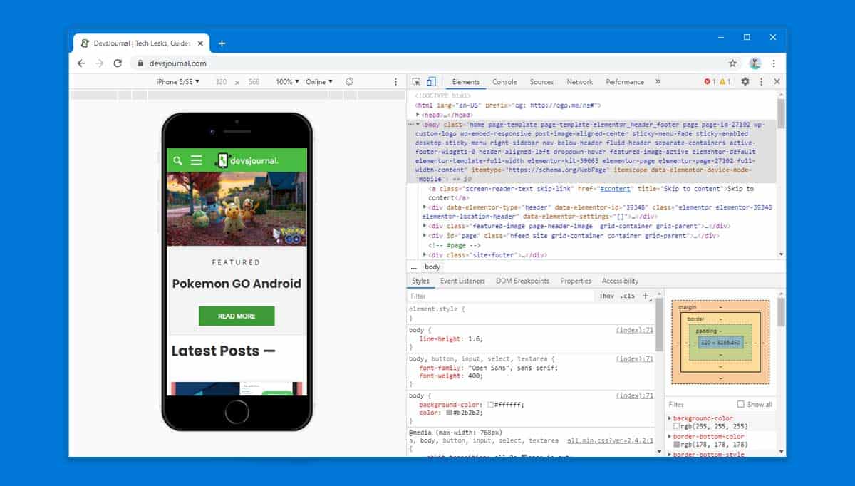
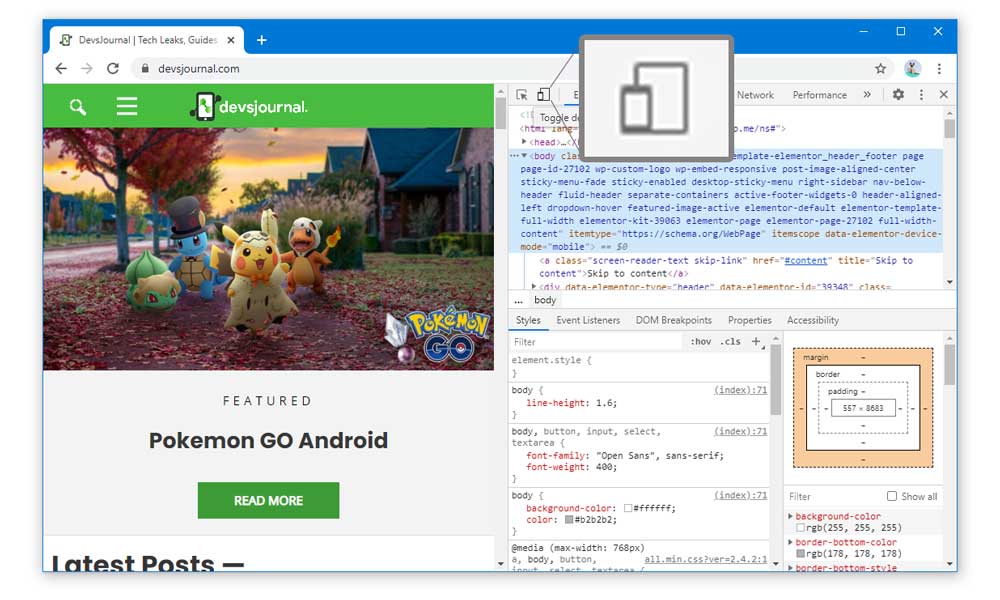
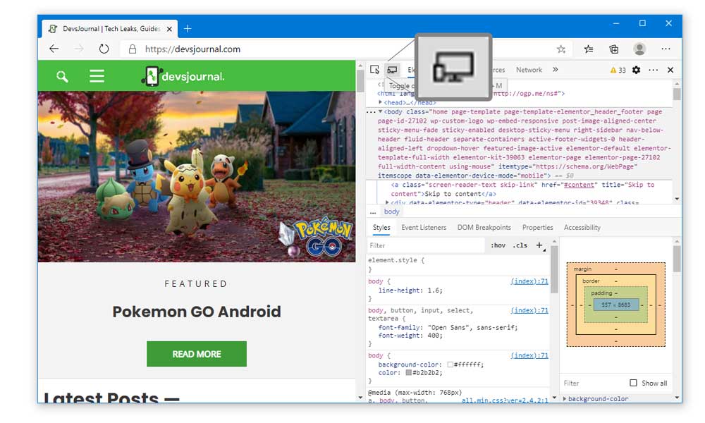
Step 5: Once you have opened the Developer Tools, locate the Toggle Device Toolbar button. Generally, it will be on the left side of the Elements button.
Step 6: If you are facing difficulties finding it, use the hotkey, Ctrl + Shift + M. It will open the Toggle Device Toolbar immediately. But, this hotkey only works when the Developer Tools window is open.
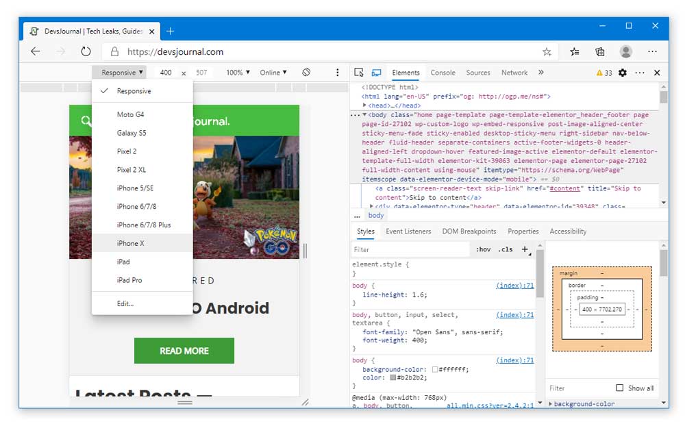
Step 7: Now, you will be viewing mobile sites on desktop. You can further click on the Responsive button and select the mobile phone of your choice as well. The view settings for will be changed automatically according to the phone you select.
Step 8: To revert back to normal, press Ctrl + Shift + M once again and close the Developer Tools window.
So, this was the complete method step by step which you can use to view mobile sites on desktop using Chrome.
B. In Microsoft Edge
In case you want to know how to view the mobile version of a website on Microsoft Edge, the process is basically the same as we have mentioned in the above method.
Step 1: Open the Microsoft Edge browser.
Step 2: Visit the website that you want to check out.
Step 3: Now, hit the F12 key on your keyboard, or you can also use the shortcut, Ctrl + Shift + I to access the Developer Tools.
Step 4: Similar to the Chrome browser, the Toggle Device Toolbar will be present on the left side of the Elements button. Or press Ctrl + Shift + M.
Step 5: As soon as you press the Hotkey, you will be viewing mobile site on a desktop in the Microsoft Edge browser.
Step 6: Use the Responsive button in case you want to see the view from your choice of mobile phone.
Step 7: Additionally, there will also be an icon that you can click on to change the screen orientation.
C. In Firefox
In the Firefox browser, the Developer Tools look a bit different as we have seen on the other two browsers till now. However, the process to access the mobile view on a desktop will remain mostly the same.
Step 1: Launch the Firefox browser and visit whichever site you want. You can proceed it while staying on the homepage too.
Step 2: Press the F12 key on your keyboard to access Developer Tools.
Step 3: On Firefox, the Developer Tools window appears on the bottom of the screen.
Step 4: At the top-right corner of the Developer tools window, you will find the “Responsive Design Mode” icon. Click on it, or you can use the hotkey Ctrl + Shift + M as well.
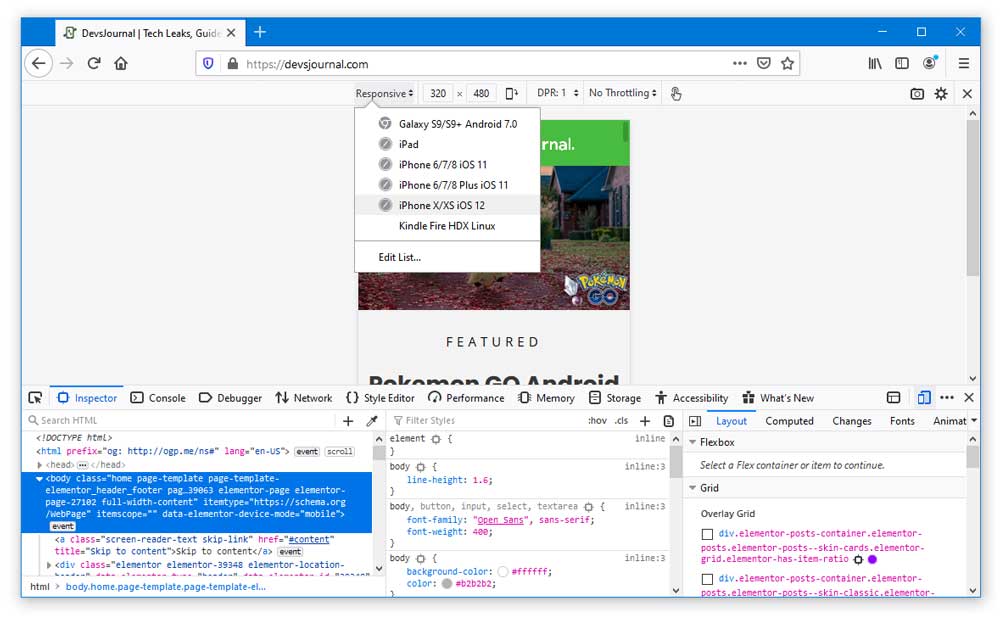
Step 5: The Responsive button allows you to change between multiple mobile phones which are suitable for viewing mobile sites on the desktop.
2. Use Third-Party websites
In case you are not satisfied with the view modes that are available in the Developer Tools of web browsers. We have found some pretty cool websites that will allow you to view the mobile version of the website in a very simplistic way.
A. Responsinator
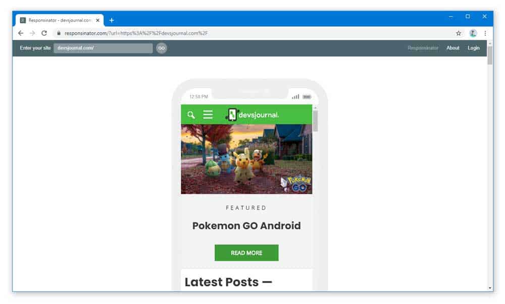
This website provides a cool way to mobile view on desktop since it has templates available for various popular mobiles such as iPhone X, Pixel 2, and many more. Along with that, the same templates are also available in both landscape and portrait orientations so that you can view the mobile site on a desktop in every way possible in a matter of seconds. All you need to do it, visit http://www.responsinator.com/ and enter the website address that you wish to view in mobile version and click on the GO button.
B. Responsive Design Checker
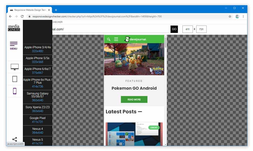
Yet another reliable website for the new developers which can help them in viewing mobile site on the desktop is the Responsive Design Checker from Media Genesis. You can click on this link: https://responsivedesignchecker.com/ to visit the website. Like the other one, you will need to enter a particular website address and hit the GO button. Afterwards, you can select the view mode from the toolbar easily. The great part about this website is that it provides you with a better and more user-friendly experience.
Conclusion
As now you know how to view the mobile version of the website using the developer tools of your browser. We believe it will be very helpful for you to create a better and responsive website in the future. Well, in case you don’t like the look and experience of the Developer Tools window, using third-party websites for viewing mobile sites on a desktop is not a bad option either. Hence, this was all from our side. If there is any query regarding anything related to this article, you can comment down below and let us know.